Article · Blog · Bug · Cars · Design · Hummer · Icons · Mini Cooper · Reverse Engineering Post · Truck · Uncategorized · Visual Design
Designer: Megan Merkley (personally done)


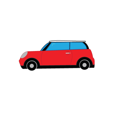
Hello again! This is just a short and sweet post to show you another of my design projects. This time my goal was to create 4 different icons, I wanted them to be recognized as a group but also as individual icon as well.


Reasons Behind The Design

I chose to do cars because my father and brother are mechanics, so I’ve grown up around cars and grown to love them along the way.

The reasons I chose the cars I did was because I planned my audience to be from the USA. So I did cars that are common in the USA and also did the colors that those cars are often seen in and or portrayed as.


Sizing

I created these in Adobe Illustrator be cause they need to be created with vector graphics. This being because raster uses pixels, so when you blow it up it can get really pixelated. Where as with vector images they are “resolution independent”, because vector uses points/mathematical lines and curves.

When making icons you want them to be able to be any size you need them to be (examples below). This is made possible with vector graphics (a.k.a. Adobe Illustrator).


Designer: Megan Merkley (personally done)


Designer: Megan Merkley (personally done)


Designer: Megan Merkley (personally done)


Designer: Megan Merkley (personally done)


All in all, I had a blast making these! I’m so glad we have this kind of technology so I could do this. Hope you enjoy these to and see how much fun you can have making/designing icons, or how great cars are!

Article · Blog · Depth of Field · Design · Leading Lines · Magazine · Magazine Spread · Photography · Reverse Engineering Post · Rule of Thirds · Typography · Uncategorized · Visual Design

Making a Fun and Unique Magazine Spread/Article

Unofficial Ad
Designer: Megan Merkley (personally done)
Unofficial Ad
Designer: Megan Merkley (personally done)


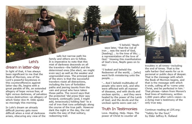
Hey there! This post is to show you a Magazine spread I designed, and how I used the Principals of Design to influence the way I put it together.


Audience and Message

Before you start it is important to know what message you are trying to get across. Once you know that, who are you trying to get that message to?

I wanted my message to give strength and help others stay strong in their faith. And my target audience is youth, and young adults, ages 14 to 25. Guys and girls, anywhere in the world.

I kept the audience pretty general because I want it to reach and touch as many as it can, so I can help share the message and testimony in it!!


Colors and Feelings

I used the “soft” but bright green to get attention and to help the reader feel the importance and warning the article conveys, without it being to strong or overwhelming. I then used the blue, gray to calm it down even more and to bring it the feeling of peace and calm. I wanted both of these colors because I wanted my audience to know that this is important and that they may be stressed but by following these guide lines they will be able to find rest and things will be OK!


Photography

The pictures I took were to show that we are all on the same path, we’re all struggling through life. I had my friends dress as they normally do to show that this article is for every everyday person, or in other words it applies to all of us! I also slanted the colors on the first page as well as first picture to lead the eye towards the picture of the Book of Mormon and temple to show that that is the goal. Even with in the picture of the temple I have the Book of Mormon in the focus and the temple in the back ground not only to use the field of depth concept to make the picture look good, but also to show that as long as we focus on the Book of Mormon and really study it, we will reach our goal (the Temple).


Acknowledgements

Please read the whole article at https://www.lds.org/general-conference/2009/10/safety-for-the-soul?lang=eng.


Photo by James Dalrymple.
Photographer: Megan Merkley (personally taken)
Blog · Depth of Field · Design · Leading Lines · Photography · Reverse Engineering Post · Rule of Thirds · Uncategorized · Visual Design

Tips And Tricks Of Photography

There are times that you can snap a picture and it can turn out great or not so great… ever wonder why? Well here’s a few things to help you get a great one every time!


Rule of Thirds

unofficial service ad
Photographer: Mr. Marlin
St. Thomas More Catholic Secondary School photography

http://www.stmphotography.ca/rule-of-thirds.html

unofficial service ad

The rule of thirds is where the object of focus takes up one to two thirds of the frame. In this picture the lighthouse is in one third while the ocean and sunset take up the other two thirds.


unofficial service ad
Photographer: Megan Merkley (personally taken)

Here, as in the picture above, the red tulip takes up one third while the white take up the other two thirds.


Leading Lines

unofficial service ad
Photographer: Paulorita

http://argentmane.tumblr.com/post/62519776160

unofficial service ad

Leading lines are to help draw or “lead” you into the picture. In this photo the lines from the bridge, boat, coastline, and even the clouds draw you deeper in.


unofficial service ad
Photographer: Megan Merkley (personally taken)

unofficial service ad

As I explained above the lines create by the nature around seem to pull you in.


Depth of Field

unofficial service ad
Photographer: Antti Lehtinen
Second Picture; tutorial of digital art and design

unofficial service ad

Depth of field is in a sense a 3D touch. In order to have good depth of field you have to have at lest three stages to your picture, the foreground, middleground, and background. In this picture the first hay bale creates the foreground, the other hay bales create the middlegound, and the trees and horizon create the background. All these put together give it that feel of being 3D.

unofficial service ad
Photographer: Megan Merkley (personally taken)

unofficial service ad

In this picture the depth of field is demonstrated with the people being the foreground, the tree as the middle ground and the hills as the background.


Conclusion

In all pay attention to things around you. Use these basic tips and tricks, and find new ways to enhance your already great pictures. And most importantly have FUN!!!

Blog · Design · Reverse Engineering Post · Typography · Uncategorized · Visual Design

The Fun You Can Have With Typography

unofficial service ad
Jukebox Print
Creating the World’s Most Unique Business Cards

https://www.jukeboxprint.com/Grey-Business-Cards.php


Identifying the first typeface (font)

unofficial service ad

This is a script typeface. You see this through the calligraphic flow that it presents. Though it could be enhanced if it were not all caps.


Identifying the second typeface (font)

unofficial service ad

This demonstrates the sans serif typeface. You can identify this by the absence of frill per say. It has no serifs, meaning the tips of the letters are straight. There is no “stress” or angle; this is because there is no thick or thin change, it is all “monoweight.”


Typeface contrasts

unofficial service ad

The biggest and most notable difference is the size. But not only that, “the modern artisan” is also much frillier, adding zest and drawing attention. Whereas the “Kenny Wong” is a lot simpler. the coloring also throws in some more contrast.


Conclusion

I love how all this comes together to to give it a little spice but still look professional and neat. It get your attention and then it is still easy to follow and find what your looking for.

Blog · Design · Reverse Engineering Post · Uncategorized · Visual Design

Great Basics For Visual Design principals

unofficial service ad
Advertiser: Gap, Inc

Advertising Agency: Ogilvy & Mather, New York, USA

http://www.advertolog.com/gap/print-outdoor/blonde-group-14974505/


Contrast:

Draw over - Contrast

You find some of the contrast in “be snap, be pop”, through texture as well as the size. Even though it is pink to match the theme, it has texture to stand out. It is also larger than the other text to bring attention to the concept they want you to focus on.


Repetition

Draw over - Repetition

As I mentioned above, the lettering matches the background and clothing. But if you notice, all of their shoes are the same type, or close to it. Creating repetition, even while being different colors.


Alignment

Draw over - Alignment

The main alignment is flush left created by “be snap, be pop”, continuing to the very bottm. There is also a strong alignment along the bottom bringing all the lettering together. As well as aligning with the line of where they are mostly standing, bringing the letter and picture together to harmonize.


Proximity

Draw over - Proximity

Here the principal of proximity comes into play with “Gap” and the ” be bright” slogan being put together, but separate from the ad’s slogan “be snap, be pop”.


Draw over - Color

In both their pants and shoes you can see primary triad color scheme. Using various tones of reds, yellows, and blues.


Conclusion

All the principals come together to make the ad more organized and aesthetically pleasing. Most importantly though is the ease of reading and understanding it. It brings you in and gets your attention, and directs you to where your focus should be. All this making it fun and effective.